BC Roma unveils its new identity
BC Roma has unveiled its new visual identity, marking another step in the construction of the club’s sporting and organizational project ahead of the new season.
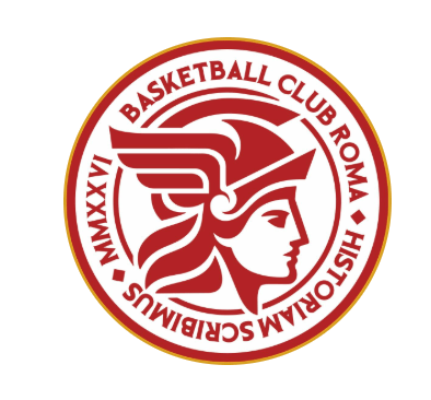
The new logo becomes the official face of the club and will accompany BC Roma both on and off the court: on jerseys, in communications, across digital platforms and on every occasion in which the club represents Rome and its basketball culture.
At the same time, the club is launching its official presence on social media, starting with its new Instagram page, which will become one of the main meeting points between the team, its fans and the city.
Visualizza questo post su Instagram
An identity born from Rome
The new identity is built around a simple principle: Rome is not simply where BC Roma plays. It is part of what the club wants to be.
The graphic project was created by FOAM, a branding and creative studio belonging to The Next Generation Platform (TNGP), and draws from the history and imagery of the Italian capital, reinterpreting them through a contemporary visual language.
The “ROMA” logotype takes inspiration from the monumentality, geometry and perspectives of Roman architecture, translating them into simple and recognizable forms.
The typography follows the same philosophy, recalling the weight and authority of Roman epigraphic tradition through a modern language designed for the present.
Goddess Roma at the heart of the crest
At the center of the new crest is Goddess Roma, inspired by representations found on ancient Roman coins and reinterpreted in a contemporary style.
The symbol evokes the roots, identity and strength of the city. The graphic reference begins with the circular structure of ancient Roman coinage before becoming an immediate and recognizable mark.
The complete crest features Goddess Roma together with the name Basketball Club Roma and the year MMXXVI. The figure’s profile can also be used independently as a distinctive club symbol.
Rome Red and Imperial Yellow
The colors are also an important part of the new identity.
Rome Red and Imperial Yellow form the primary palette, complemented by Tyrian Purple and Tiberian Night as secondary colors.
The palette is designed to connect the new project with the history and imagery of the Italian capital.
An identity built around a larger project
The new logo is not simply intended to give BC Roma a visual identity. It is designed to represent the culture on which the club wants to build its future.
BC Roma aims to combine organization, discipline and international ambition with the authentic and popular passion for basketball in Rome and across Europe, building a club capable of competing at the highest level without losing touch with the roots of the game.
A strong connection with the community
The project also has a strong focus on the local community.
BC Roma wants to be present across the city’s neighborhoods, bring children and families closer to basketball, support grassroots development and gradually create a genuine pathway for local talent from youth development to the first team.
The ambition is therefore not simply to bring high-level basketball back to the capital, but to reignite Rome’s basketball culture, develop its talent and gradually return the city to the international stage.
The ultimate goal is to make Rome a true European capital of basketball.
“The beginning of a journey”
The new logo therefore represents not an end point, but the beginning of a journey that will accompany BC Roma’s sporting project and its initiatives to build an increasingly strong relationship with the city.
A new identity for a new project. With Rome in its name, its history and its ambition.


Commenta
Visualizza commenti